Data Viz
Interactive data viz stories for Vox.com.
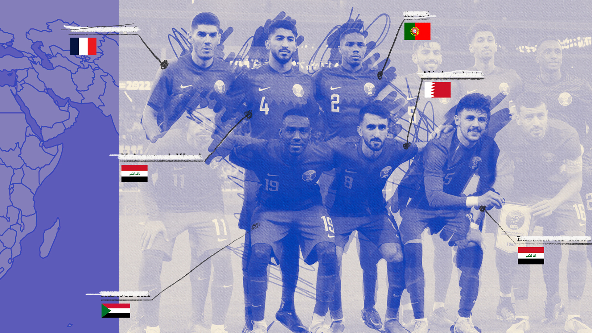
How migration has shaped the World Cup
An interactive analysis of how foreign‑born players have influenced World Cup history. Designed and art‑directed the visual experience, integrating data maps and custom graphics to make complex trends engaging and accessible. Read the story →
Credits
Art Direction, Design: Dion Lee
Story & Graphics by: Youyou Zhou, Stephen Osserman
Editor: Caroline Houck

How Russia’s invasion transformed one Ukrainian city (Vox x The Pudding)
A visual journey tracing a route through Kharkiv — documenting how neighborhoods were transformed by the Russian invasion. Collaborated with The Pudding’s data journalists to blend mapping, illustration, and editorial design. Read the story →
Credits
Art Direction: Dion Lee
Story by: Jen Kirby
Graphics by: Jan Diehm, Hesham Eissa, and Lindsey Poulter from The Pudding
Editor: Caroline Houck